MONOCHROMATIC MONDAY PLUS # 13 ~ MONOCHROMATIC #27

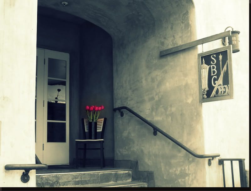
The Picture I picked this week was one I took when
I was in Capitola with John & Cherie...
Cherie actually saw the little restaurant first
(she loves tulips),
but I had to snap a couple of pictures of it too.
It just looked so charming with the tulips out front!
I started with this!
1. of course pulled it up in Picnik
2. Went straight to create ~ effects ~ Focal B & W
3. Adjusted the size ~ Hardness & Fade
4. The went to Cross Process and adjusted the Fade
5. Next went for the frame and decided on a Drop Shadow
6. Picked the color (black in this case)
7. adjusted the Distance ~ Angle ~ Size & Fade
Loved it but the Cross Process had put some color back in the wall.....
so this was what it gave me....
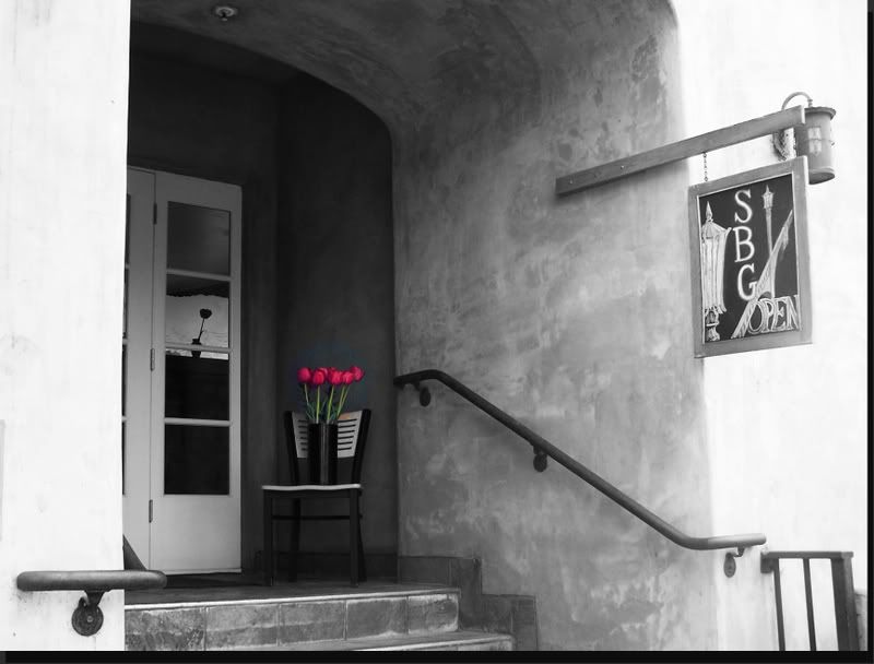
So to keep it Monochromatic
I went back and did the focal black and white again!
(but I like the one above best ~ LOL)
And now my Plus...
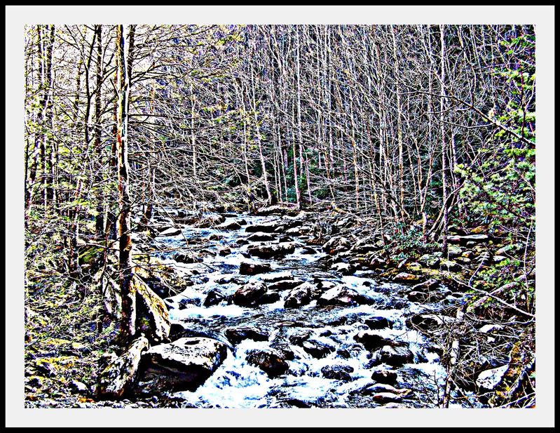
I started with this picture.....
Well, it is not really a plus....
I was just trying to get it to look like a painting instead of a photo.
I'm not sure I did that but I tried.
WISHING EVERYONE A GREAT WEEK!!!!!


Linda I think the gators eyes are wonky cause Im not seeing the finals :(
ReplyDeleteOh no!! Can't see the Photobuckets!!
ReplyDeleteme three...but then you know cause I just told ya
ReplyDeleteI think there is an issue with Photobucket... I am not seeing any of the pics from there on your site... like your header - that's gone too!
ReplyDeletei hate when i loose my head
ReplyDeleteROFL ~ will try to fix but if it is photobucket ~ will have to do that tomorrow as I work tonight and have to nap..... don't want no grouchy nurses at that place tonight!
ReplyDeleteI do it often... and footers are just as bad...
ReplyDeleteNo!! No grouchy nurses!!
ReplyDeleteagreed no grouchy nursies
ReplyDeleteWell, Photobucket is having a problem.... Will have to fix this tomorrow morning when I get home...
ReplyDeleteWon't go to Monica's page and post until after than.... so as not to make everyone else grouchy either! (Big Smile) and thanks all three of you.... Wonder how long it would have taken me to notice?????
aw you would have caught it quick im sure
ReplyDeletehugs and jave a great night at work
ReplyDeleteThanks so much, Gary... will work hard. Hope you are enjoying your week off of MM!
ReplyDeleteI just love tulips....can we go again in November.....if John will share a little better this time.
ReplyDeleteI can see!!!!! I can see!!!!!
ReplyDeleteThat first one is stunning! I love what you did! I just love the second one... simply because it is beautiful *sigh*
ReplyDeleteHey, it's all back up!! Yippee!! I absolutely love the contrast of the tulips against the building! Beautiful!
ReplyDeleteIt's up and running now! I'm gonna post your addy, feel free to come and add your personal touch!!!
ReplyDeleteI think they are both wonderful! Love the color of the tulips! Gorgeous! Hmm I think I agree the first conversion seems to work here and I'm usually a b&w over sepia tones person! Great work! On the plus side, I get a feeling of paint on metal! I love it! Very exciting conversion full of energy! Wonderful work!!!
Oh Linda I love the one with the cross process it just calls to me.
ReplyDeleteFirst, the little restaurant -- I love them all, especially the 2nd to last (Cross Process /:-)
ReplyDeleteThe Plus --- well the result looks snow covered to me, whatever I liike it very much.
i love the cross process, gave the picture a somewhat vintage matte effect. sophisticated work. ^&^
ReplyDeleteI love what you did on that first picture
ReplyDeletethat look so nice I would hang it on my wall
http://ladykatya.multiply.com/journal/item/772/MM_27_plus_13_Guest_Hostessing
Wow love the tulips, fantastic job on both. The last one does look like a painting, good work.
ReplyDeletehttp://bonniels.multiply.com/journal/item/287/_MonoMonday_-_27_plus_13
both of them look great..
ReplyDeletehttp://vickiecollins.multiply.com/journal/item/493/Mono_Monday_27_and_plus_13
I really like the effect on the second, after you used the cross tool. The third is great too. The way you cropped it really pulls the viewer into it. And the last one does look like it was painted.
ReplyDeleteWow it is lovely. Love what you did with it. The first picture you can barely see the tulips or the effect it had on you viewing it. But after you were done I could see what you saw. Loved it.
ReplyDeleteEmpress C's Mono Plus
that is a nice find and the tulips in color make a great shot to color back in on a mono style...and your plus was well worht the wait to see..both are very good linda and i wish you would have come to play sooner and also that photobuket fixed itself
ReplyDeleteThe first one was really stunning.... like a snapshot of some romantic villa hideaway someplace exotic...
ReplyDeleteAnd a total WOW on the second. A great first shot, and what an amazing result with your alterations to the shot. So pretty.
-janeen
http://fluffyj.multiply.com/journal/item/313/October_6_2008_Mono_Monday_Plus_13
This is all good..I gotta get into this monochromatic stuff..
ReplyDelete